Why Your Website Isn’t Getting Clients: 4 Quiet Credibility Leaks to Fix

That small wince before you share your website link? It’s not imposter syndrome. It’s information. And most of the time, it’s pointing to a credibility gap, a mismatch between the level of expertise you’ve genuinely earned and what your website is quietly communicating to the people who land on it.
It’s more common than you’d think: established professionals with years of experience, strong client results, and real authority in their field, paired with a website that makes someone hesitate before clicking “Contact.” The website isn’t necessarily bad. It’s just leaking credibility in four very specific, very fixable ways.
Those four places are: clarity, proof, path, and presence. Fix even one issue in each area and your site starts working harder without you doing anything differently.
Let’s start where the gap shows up fastest.
What You'll Learn in This Article
If you’re more of a visual person, be sure to view the companion video on my YouTube channel.
1) Clarity: Make your hero section do its job
Clarity is about what happens in the first three seconds someone spends on your site. They’re deciding, almost instantly, whether they’re in the right place. If your message is fuzzy, they don’t stick around to figure it out. They leave, and they don’t feel bad about it.
Signs your headline is leaking credibility
The most common clarity leak sits right at the top of your homepage. A few to look for:
A headline so generic it could belong to five different businesses in five different industries.
A visitor can’t tell who your services are for in five seconds.
You name an outcome, but it’s vague enough to mean nothing (the classic “level up your brand” without telling anyone what that actually looks like).
Your ideal client, specifically the established professional who’s been around long enough to know what she’s looking for, wants to feel an immediate internal click: “Oh, this is for me.” When your top-of-page copy is specific, it works like a confident guide at the front door. When it’s unclear, it works like a locked lobby with no directory.
A 30-second fix: rewrite the first two lines
If you do one thing today, do this. Rewrite the first two lines of your homepage hero section so they clearly answer:
Who your services are for
What outcome you deliver
That’s it. Two lines. A simple pressure test: if a stranger read only those two lines, could they tell what you do, who you help, and why it matters? If not, keep adjusting until they can.
If someone has to figure out what you do, they won’t. They’ll move on.
You don’t need clever. You need clear. Once your hero section is doing its job, everything else on your site has a much better chance of working.
If you’re interested in exploring this more deeply, check out this article that takes a more detailed look at website clarity.
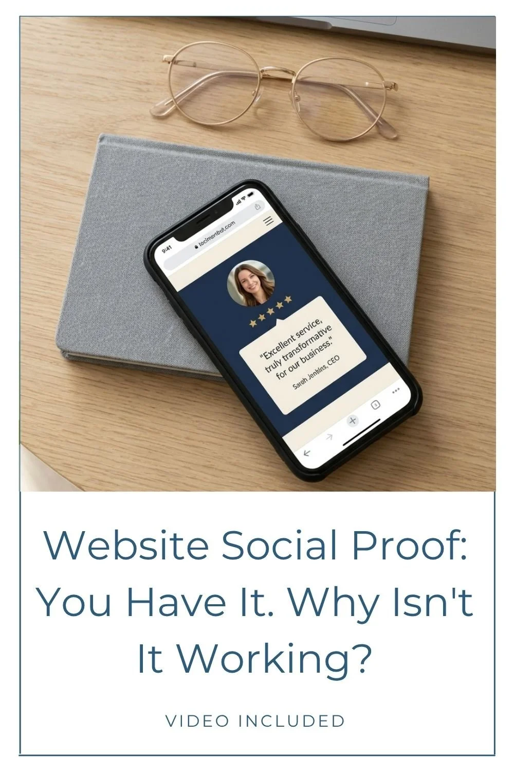
2) Proof: Show evidence where decisions get made
Clarity gets someone to stay. Proof helps them believe.
Proof is the evidence that you’ve earned your expertise and that you can deliver what you promise. Testimonials, media features, credentials, podcast appearances. The things that turn “sounds good” into “I trust this.”
The credibility gap widens fast when proof is present but buried, or when it’s so generic that it doesn’t do any real work.
Signs your proof isn’t pulling its weight
Testimonials exist, but they live on a page people rarely visit.
The testimonials you have are polite but vague, think “Great experience!” with no specifics.
Nothing on your services page helps someone think, “people like me hire her.”
A vague testimonial reads like polite applause. It’s nice, but it doesn’t reduce doubt. Strong proof shows what changed for the client, what the process felt like, or what they walked away with. Specifics are what close the gap.
Quick fix: put proof above the fold
Take a fresh look at two pages: your homepage and your services page.
On your homepage, aim for at least one solid piece of proof above the fold (or close to it), so it lands early in someone’s scroll. On your services page, place proof right next to the service description. That’s where decisions happen.
If your testimonials are currently vague, update what you collect going forward. Instead of asking only “How was it working together?” try: “What was the outcome, and what did you notice after?” You’ll get answers worth using.
One detail that’s easy to skip: showing there’s a real human with real experience behind the site. If your site runs on Squarespace, adding author details to your content reinforces that. This walkthrough on how to add an author bio in Squarespace is a practical place to start.
3) Path: Give people one clear next step
Think of “path” as the experience of moving through your site. Once someone lands, do they know what to do next? Can they find what they need without working for it? Or does your site quietly ask them to figure it out?
A clear path builds confidence. It quietly tells someone: this is organized. You’re in good hands.
Signs your site is creating confusion instead of confidence
You have so many calls to action competing on the same page that a visitor doesn’t know where to look. (Book, Download, Follow, Contact, Watch, Learn, Subscribe… all on one scroll.)
Your services read like a menu without a recommendation. You list the options, but you don’t help someone choose.
There’s no obvious “start here” moment. The site meanders.
Too many choices creates a freeze response. When people don’t know what to do, they often do nothing.
Quick fix: pick one primary CTA and repeat it
Choose one primary next step for each key page, then repeat it consistently.
Your main CTA might be “Book a consult,” “Inquire,” or “Get a quote,” depending on your business. Once you’ve picked it:
Put that CTA in your hero section.
Repeat it after your services overview.
Include it near the bottom of the page for someone who needed a little more time to decide.
This doesn’t mean every button has to be identical. It means you want to avoid a page where every button has a different job. Consistency is a trust signal. It reinforces where you want them to go, and it makes your site feel easier to navigate.
If you’re curious what a calmer, more guided process can look like when it comes to the website project itself, this post on a web designer’s calm and clarity process explains the kind of structure that removes most of the guesswork.
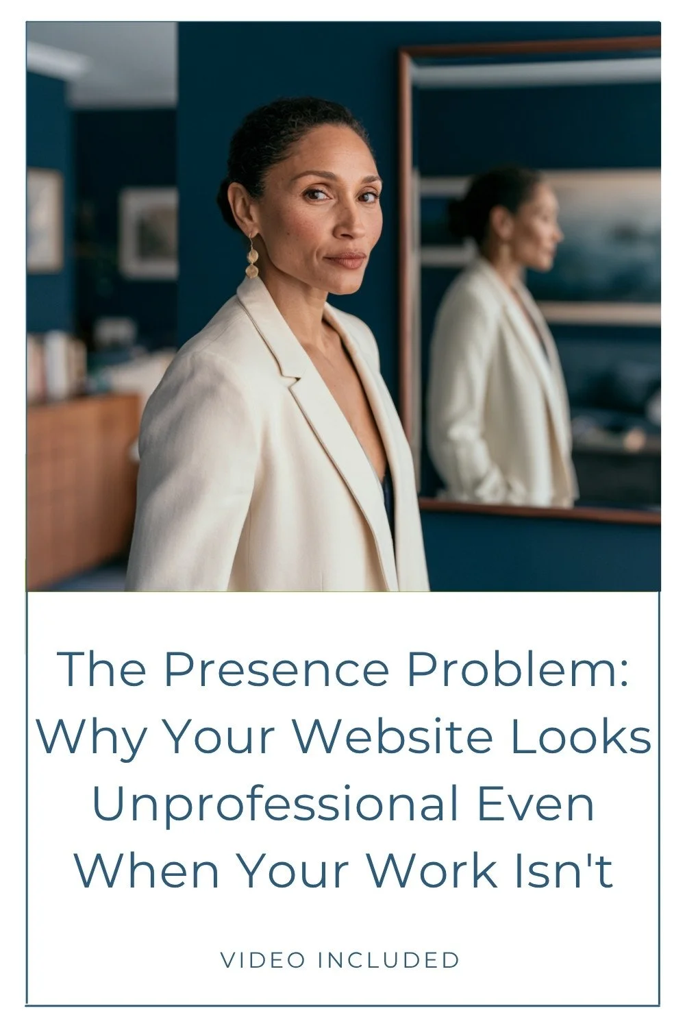
4) Presence: Make your site match your expertise
Presence is the overall impression your website makes. It’s how the design, visuals, and copy work together to communicate who you are. And it’s often where the credibility gap is most visible, because the mismatch between someone’s real-world authority and their website’s visual language is something visitors feel immediately, even if they can’t name it.
Your work is high-level. Your site should reflect that.
Signs your presence is undermining your credibility
The site feels visually busy, with too many elements competing for attention at once.
Imagery feels dated, inconsistent, or disconnected from your current level.
The copy doesn’t sound like you. It sounds generic, trend-chasing, or, yes, unmistakably AI-written instead of your actual voice.
Professionalism is a form of self-respect. When your online presence doesn’t match your actual expertise, it’s not just a design problem. It’s a credibility tax you’re paying every day.
Quick fix: remove one layer of noise
You don’t need a full redesign to improve presence. Start with one focused pass:
Remove one competing element from a section (an extra image, an extra badge, a paragraph that’s doing too much).
Aim for one clear visual direction, especially with imagery.
Add more breathing room between sections, images, and text. White space isn’t empty space you forgot to fill. It’s the pause that makes everything else easier to read.
If color is part of what’s making your site feel visually loud or inconsistent, it helps to understand how your platform actually handles it. This guide to the Squarespace color palette system can help you create a more cohesive look without hunting down tiny edits all over your site.
A 10-minute credibility audit you can do today
If you’re not sure why your website isn’t converting, don’t try to overhaul everything at once. Set a timer for 10 minutes and do a quick scan through each of the four areas. You’re looking for the biggest leak in each one.
Clarity: Rewrite the first two lines of your homepage. What do you do, who do you serve, and what result do you deliver?
Proof: Add one strong proof point above the fold. Make sure it’s specific and visible early.
Path: Choose one primary CTA and repeat it. Cut the competing buttons on each key page.
Presence: Remove one layer of noise. Space things out. Update anything that no longer sounds or looks like you.
Small changes add up. Fixing one thing in each area can stop the quiet leaks that are costing you real inquiries.
Stop the leaks, let your expertise show
That uneasy feeling before sharing your link isn’t something to push through. It’s a signal worth listening to. And more often than not, it’s pointing to something specific and fixable.
When you tighten up clarity, add visible proof, create a consistent path, and strengthen your presence, the credibility gap closes. Your site stops quietly undermining you and starts doing what it’s supposed to do: making the right people feel like they’ve found the right person.
Pick one small change from each section and make it real this week. Progress over perfection, always.
Ready for a second set of eyes?
Sometimes the hardest part isn’t making the changes. It’s seeing the leaks clearly when you’ve been staring at your own site for months. (Hey, it’s something even us professionals struggle with too!)
If you want a second set of eyes, here’s where to start:
If you’re ready for a website that finally matches the credibility you’ve built, you can explore custom web design and see what a full transformation looks like.
If you just want an expert to walk through your current site and identify exactly where the leaks are, a Power Hour consultation is the fastest way to get a clear, specific plan without committing to a full project.
Either way, the goal is the same: a site that works as hard as you do.
You may also find these articles helpful: