The 8-Minute Homepage Rewrite That Gets You Clients

If your homepage isn’t getting inquiries, it usually isn’t because you’re not good at what you do. More often, it’s because people can’t understand you fast enough to stick around. Your homepage isn’t an introduction. It’s a decision shortcut. If buyers land on your site and feel confused, they won’t keep reading, they’ll move on.
And here’s the uncomfortable part: for a lot of established women professionals, their homepage is confusing. Not because they don’t know their work. Because their site hasn’t caught up with them yet. That gap between how good you actually are and how your website presents you? That’s the credibility gap, and it quietly costs you clients every single day.
In my previous blog post, I introduced the four places the credibility gap shows up on your website. Today we’re going deep on the first one: clarity above the fold.
What You'll Learn in This Article
I’ll walk you through the process of how to do this below, but if you prefer watching a tutorial, be sure to view the companion video on my YouTube channel.
The good news is you don’t need to rewrite your entire website to start closing the gap. You can start with one high-impact spot: the first section people see before they scroll, your hero section. A focused homepage rewrite can make your message easier to understand and make it easier for the right people to take the next step.
If you fix this one section, your entire site will likely start converting better.
Why homepage clarity above the fold matters
Think of your homepage like a fast filter. People arrive with a tiny window of attention, and they’re silently asking, “Am I in the right place?” If your site makes them work to figure that out, they won’t. Don’t make them do the work.
In my work as a web designer, I see the credibility gap surface in four main places:
Clarity — Is it immediately obvious who you help and what you do?
Proof — Does your site signal that you’re the real deal, fast?
Path — Does your site guide visitors toward a clear next step?
Presence — Do your visuals and design actually match your level of expertise?
Today, we’re focusing on the first one, clarity. Specifically, above the fold, because it affects everything else. When your message is clear right away, it becomes easier for visitors to trust you, follow your site, and act.
This matters even more if you’re an established service provider. You already have real expertise. You’re already excellent at your work. But if your site reads like a vague introduction, or if it takes too long to get to the point, it won’t reflect that. Your homepage becomes a visible credibility gap.
The good news is that above-the-fold clarity is one of the quickest wins you can get. You’re not rebuilding five pages. You’re not rewriting your whole story. You’re simply making sure the first thing people see answers the questions they’re already asking.
So let’s define what “above the fold” means, then walk through what your hero section needs to do, what to remove, and how to rewrite it in eight minutes.
What “above the fold” means on a website
From newspapers to your hero section
“Above the fold” comes from print media, newspapers specifically. Back when people actually held a folded newspaper in their hands, the big headlines and main stories lived on the top half, above the fold, because that’s what people saw first.
On a website, the concept is the same. Above the fold is the first big section of a page, often called the hero section, what someone sees before they start scrolling.
It’s your first impression. But it’s more than that. It’s your clearest chance to help someone understand what you do, who it’s for, and what to do next. Done well, it starts closing the credibility gap before a visitor even makes it past the first screen.
The four things your hero section must communicate
That above-the-fold area needs to do four things. If it misses these, the rest of your homepage has to work too hard.
Tell visitors who your website is for. Make it obvious who should keep reading.
Show the outcome of working with you. What changes for them after they hire you?
State what you deliver. What do you actually provide — your service, offer, or deliverable?
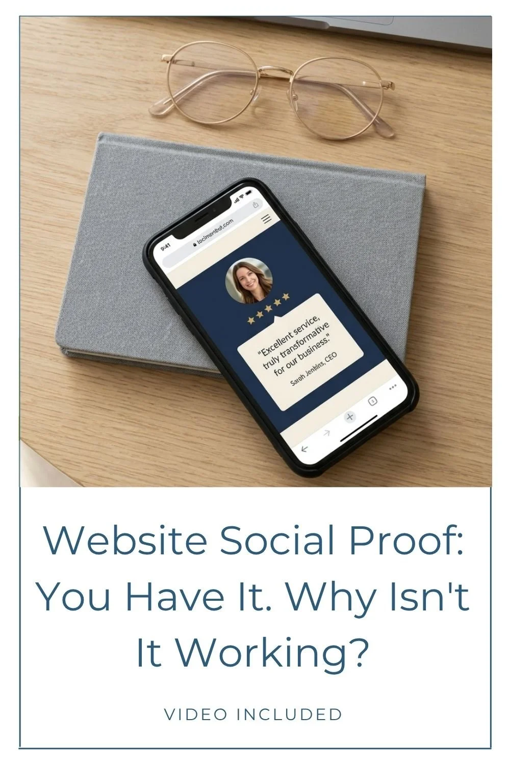
Include proof. Add evidence that supports your expertise and credibility.
This is why clarity is the first credibility leak to fix. When you lead with a clear message and support it with proof, you’re not forcing people to guess. You’re helping them decide.
A simple hero section structure (with example copy)
Start with a clear “who + outcome” line
If you want a clean way to structure your hero section message, start here: one or two sentences that say who you help and the outcome they can expect.
Here’s an example of using my own business:
“I design strategic Squarespace websites for established women service providers and creative professionals, so your online presence finally has the authority to attract the premium clients your expertise deserves.”
Notice what this does in a single breath. It speaks to a specific audience (established women service providers and creative professionals), and it describes the outcome (an online presence that has the authority to attract premium clients). No fluff. No vague promises. Just: this is who I’m for, and this is what changes.
You don’t need a long explanation here. Above the fold, your job is to be clear, not exhaustive.
Follow with one call to action, then add proof
Right after your main statement, include a clear call to action. Keep it simple and action-oriented. For example:
Book a free consultation
Enroll now
Explore my services
Then, closely after that, include proof. This can be a small piece of evidence that supports what you just claimed: a testimonial from a past client, a short listing of professional credentials, or logos of organizations or publications you’ve been featured in.
The order matters. When someone sees a clear message, a next step, and a quick proof point, it reduces hesitation. It also keeps the hero section from becoming a wall of text. Aim for clear, concise, action-oriented copy backed by evidence. That mix helps the right visitor feel confident enough to keep going.
Hero section clarity killers to delete or move
Even if you have strong services and a great reputation, a few common hero section habits cloud your message. These aren’t “never use this anywhere on your site” items. They’re “don’t lead with this above the fold” items.
Content that doesn’t belong above the fold
One of the biggest clarity killers is a long origin story. Your visitor doesn’t need your full backstory in the first screen of your homepage. Save that for a dedicated About page, or a “Get to know me” page if that’s something you want on your site.
A short “about me” blurb can work further down your homepage, once someone has decided they’re in the right place. But the hero section needs to earn their attention first.
Another common issue is generic value paragraphs, the kinds of statements that sound positive but don’t say much. They can be helpful later as people scroll and learn more, but they usually don’t grab someone right away because they don’t clarify what you do or who it’s for.
If your hero section feels crowded, it’s often because it’s trying to do too many jobs at once. Move the extra content down the page and let the first section focus on clarity, action, and proof.
Too many buttons and vague language
Buttons can create friction when there are too many choices. Ideally, your hero section should have one call to action, one button. For most websites, one clear next step is all you need.
The exception is if you serve more than one audience and those groups need different paths through your site. In that case, two buttons that speak directly to each group can be warranted. But it’s a narrow exception. If you’re not sure whether you need two, you probably don’t.
Think of it this way: one CTA creates a clear next step. Two CTAs help distinct audiences self-select the right path. Anything beyond that just creates hesitation.
Along with button overload, watch for vague language. A line like “I help women thrive” sounds nice, but it’s too generic on its own. If you say something like that, you need to follow it with how, in a way that connects to what you actually deliver.
Look for anything that makes the hero section feel busy or confusing. Then delete, rearrange, or move it lower on the page so your main message can breathe.
Your 8-minute homepage rewrite plan
This is the simple process to rewrite your hero section fast, without getting lost in your current site copy.
Write your new hero section off-page (timer on)
Set a timer for eight minutes. Use your phone, your watch, whatever works. Then, don’t look at your website yet. Do this off-page, in a notebook, in your favorite note taking app, anywhere that isn’t your live site.
In that eight minutes, write three things:
Your who + outcome line. Who do you serve, and what outcome can they expect from working with you?
One call to action. Pick one next step you want someone to take, and write the button text.
Your proof. Choose one piece of evidence that supports your claim: a testimonial, credentials, organizations you belong to, or media you’ve appeared in.
Keep it short. Keep it clear. This isn’t the moment for a full overhaul of every sentence on your homepage. You’re building a strong starting point for the first screen people see, one that actually closes the credibility gap instead of widening it.
Update your homepage, then give it 30 to 60 days
Once you’ve written your new message, go back to your homepage and scan for the clarity killers we talked about: vague language, long intros, origin stories, generic value paragraphs, extra buttons that don’t belong in the hero section.
When you spot something noisy, note it. Then decide whether it belongs lower on the homepage or on a different page entirely.
After that, update your hero section with your new message and give it time before you judge it. Run it for 30 to 60 days and monitor your metrics so you can see if visitor behavior changes. You can tweak over time too, because websites aren’t static. They’ll evolve with you.
When you want professional help tightening your homepage message
Sometimes you can feel that your homepage is “almost there,” but you can’t see what to prioritize anymore because you’ve been staring at it too long. (Hey, it’s something even us web designers struggle with on our own sites.)
If you’d prefer professional support, help deciding what to prioritize, tightening your message, or figuring out whether you’re ready for a full credibility-first redesign, that’s exactly what I do.
If you’re weighing what it looks like to invest in a custom site or redesign, this guide on custom Squarespace website costs can help you understand what’s typically included. And if you’d like a fresh set of eyes on your site specifically, a Power Hour is a great place to start. It’s a focused hour where we can look at exactly this kind of thing together and map out your next steps.
Closing the gap starts at the top
Your hero section has one job: help the right person understand you fast, and feel confident taking the next step. Right now, a lot of established professionals are losing that moment — not because their work isn’t good enough, but because their homepage hasn’t caught up with their expertise yet. That’s the credibility gap, and this is one of the fastest places to start closing it.
Try the eight-minute homepage rewrite, update your above-the-fold section, then give it time while you watch your metrics. Small edits here can create a noticeable shift, because when clarity improves, everything that follows improves with it.
If you rewrite your hero section this week, what’s the one sentence you want a new visitor to understand the moment they land?
You may also find these articles helpful: