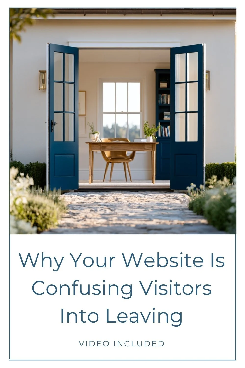
Why Your Website Is Confusing Visitors Into Leaving

When your website is confusing visitors, they don’t stop and think, “this site has a navigation problem.” That’s not the language running through their head. They just feel unsure. A little uncertain. And they leave.
That’s what makes path one of the sneakier credibility leaks on a website. It looks like a user experience problem from the outside, but underneath it’s actually a trust problem. And those aren’t the same fix.
If you’ve already worked through clarity and proof as places where your website can lose trust, path is the next one worth looking at. And if you’re jumping in here without the full picture, this post on the four credibility leaks is a good place to start.
What You'll Learn in This Article
If you’d rather watch than read, the full video is right here. Same content, different format. Pick whichever one works for you. Still here? Let’s get into it.
What “path” actually means
Path is the experience of moving through your website. Not the design by itself, not the copy by itself. It’s the overall sense of direction your visitor gets from the moment they land.
You’ll often hear this called the customer journey, and when it’s working, that’s exactly what it feels like. Your visitor arrives and feels guided. They understand who you are and what you do. They can tell quickly whether your business is for them. And the next step feels obvious, not like something they have to work out.
That effortless quality isn’t an accident. It comes from someone having thought carefully about what a visitor needs to know first, what they need second, and what should feel like the natural move after that. When the thinking is in place, your visitor doesn’t even notice it. They just move through your site and know what to do next.
When it breaks down, though, one of two things tends to happen. Either your visitor feels pulled in too many directions at once, or they feel like they’ve been left alone to figure it out. Neither one builds confidence.
If someone needs a map to get through your site, you have a path problem.
And here’s why that’s worth taking seriously: a messy path doesn’t just frustrate people. It widens the gap between the quality of your actual work and the experience your website is delivering.
Your website is confusing visitors with these three path problems
Too many calls to action competing for attention
This is the most common one, and it’s genuinely easy to miss because every item fighting for attention probably belongs there.
Maybe you’ve got a Book a Call button, a banner for a new offer, a freebie pop-up, a link to your portfolio, and a newsletter sign-up. All on the same page, all styled the same way, all asking for attention with equal urgency. Each one makes sense on its own. That’s exactly why this is hard to catch.
But when everything has the same visual weight, your visitor has no signal about what actually matters most. When everything is a priority, nothing is.
From where your visitor is sitting, they’ve landed on your site and within seconds are being asked to do five different things with no help sorting out which one is most relevant to them. That kind of overwhelm moves fast. Most people won’t push through it. They’ll just decide it’s too much and close the tab.
All the right information, but no clear order
This one’s sneakier.
Your website might genuinely have everything a visitor needs. The services page explains your offers. The About page covers your background. The FAQ handles the questions people actually ask. The information is there.
But it’s organized around the way you understand your business, not the way someone new is going to encounter it for the first time.
You’ve been inside your business for years. You know where everything lives and why. Your visitor is orienting to it in real time, without any of that context. They don’t know that the services page has the detail they’re looking for, or that the About page answers the question they haven’t thought to ask yet.
If your website expects them to piece the story together on their own, the burden falls on them. And when visitors feel like they’re on their own, they tend to assume, without thinking twice, that your business probably isn’t quite the right fit. Not because they did the math and came up short. Because the experience felt uncertain.
When a visitor feels uncertain, your website isn’t building trust. It’s spending it.
Serving multiple audiences without giving them a clear fork in the road
This one can sound a little counterintuitive right after what I just said about too many options, but stay with me.
If you serve more than one distinct group (say, other professionals alongside general clients, or two different client types with genuinely different needs), you have to help those people sort themselves into the right path quickly. Not after three paragraphs. Right away.
When both groups land on the same page and have to hunt for where they belong, you’re asking them to do work that shouldn’t be theirs. Most people won’t do it. They’ll assume they’re in the wrong place and leave.
This doesn’t mean adding an extra link to your navigation menu. It means making the fork visible early, ideally right in your hero section, where someone can recognize their path within seconds. Not buried in a sub-menu. Not something they have to guess at. Clear enough that they know immediately where to go.
If they have to go looking for their path, many will simply decide you’re not for them.
Why websites end up this way
You know your own business too well
Most path problems don’t happen because someone made a careless choice. They happen because the person who built the site (often you) knows the business so well that the internal logic of it feels completely obvious.
You can move through your own website without thinking, because you already have the map. The problem is your visitor doesn’t. If your site assumes they do, that’s where things start to fall apart.
Your business grew, and your site got layered instead of restructured
This gets more pronounced the longer a business has been running.
You started with one offer, then added another. Maybe your positioning shifted. Maybe your audience expanded, or you added a blog, a podcast, a new service. Each time, you updated the site to reflect it. But here’s what often doesn’t happen: no one stopped to ask whether the overall journey still made sense.
When a site grows that way, page by page, offer by offer, update by update, it starts to feel like a house that had additions put on without any thought for how the whole thing would flow.
When my husband and I were house hunting after we got married, we came across a beautiful Craftsman house in a great neighborhood, at a price we actually liked. We really wanted to love it. Then we walked inside.
Someone had added a massive modern addition onto the back. Off to one side, visually disconnected from the original. From the street it already felt wrong. Inside it was worse. Rooms didn’t connect in any logical order. Styles clashed. You kept stopping mid-step thinking, “what on earth were they thinking?”
We walked out instead of putting in an offer. Which was the last thing we wanted to do.
The original house was fine. The addition, on its own, wasn’t bad. Together, with no unifying logic holding them, the whole thing fell apart.
That’s what happens to a website that grows without anyone tending to the thread of the overall journey. Your individual pages might be perfectly fine. Your offers might be clear. But if the experience doesn’t hold together for someone who’s never seen it before, they’ll feel that disconnect even if they can’t name it.
What a clear website path actually feels like
A well-structured site doesn’t feel impressive. It feels calm.
There’s one clear primary action per page, and everything else supports it instead of competing. Information arrives in an order that makes sense to someone new: here’s what this is, here’s who it’s for, here’s what to do next. Your navigation helps without crowding the experience.
If you serve multiple audiences, the fork in the road is early and obvious. Someone can land on your homepage and find their path within seconds, not after hunting through sections and making their best guess.
When a site is doing this well, your visitor won’t notice. They won’t stop to think about how well-organized it is. They’ll just know what to do next, and it’ll feel easy. That ease is trust, even if neither of you has named it.
This is where a lot of website advice misses the mark. Path problems get handed off as navigation cleanups: swap a button, remove a link, tidy up the menu. But that’s not how your visitor experiences it.
They’re not landing on your site and thinking, “this navigation is poorly structured.” They’re just feeling unsure. And that uncertainty gets attached to you and your business, not to your design choices. A site that doesn’t seem to know what it wants people to do makes people wonder if the person behind it does either.
You don’t have to write “trust me” anywhere on your homepage. When your path is clear and intentional, trust shows up in the experience itself.
Not sure where the credibility gap actually is?
If any of this is landing uncomfortably close, the first move isn’t a full redesign. It’s knowing which gap type you’re actually dealing with.
The Credibility Gap Type Quiz is 11 questions and takes about two minutes. It’ll give you a clearer read on whether path is your biggest issue, or whether clarity, proof, or presence is doing more damage. That way you’re fixing the right thing instead of shuffling things around and hoping.
Ready for a second set of eyes?
Sometimes the hardest part isn’t knowing what to fix. It’s being able to see it clearly when you’ve been staring at your own site for months. (Hey, it’s something even us professionals struggle with too!)
If you want someone to look at it with you:
For a full website transformation that closes the credibility gap for good, you can explore custom web design and see what a complete overhaul looks like.
If you’d rather have an expert walk through your current site and pinpoint exactly where the leaks are, a Power Hour consultation is the fastest way to get a clear, specific plan without committing to a full project.
Either way, the goal is the same: a site that works as hard as you do.
You may also find these articles helpful: