The Presence Problem: Why Your Website Looks Unprofessional Even When Your Work Isn't

You know that specific kind of cringe? Someone asks for your website, and your stomach does a small, involuntary thing before you share the link. You send it anyway. But there's a beat.
That's not imposter syndrome.
And it's not perfectionism.
Most of the time, it's a website that looks unprofessional relative to where you actually are — a site that's presenting a version of you and your business that no longer exists. That gap between what your work actually is and what your website communicates about it is what presence is, and it's the fourth and final credibility leak in this series.
If you've been following along, you've already worked through clarity, proof, and path. Those three are concrete and auditable. You can look at your homepage and spot what's broken in a few minutes. Presence is different. It doesn't show up as a single fixable element. It shows up as a feeling. And those take a little more work to diagnose.
This post is here to make it more concrete.
What You'll Learn in This Article
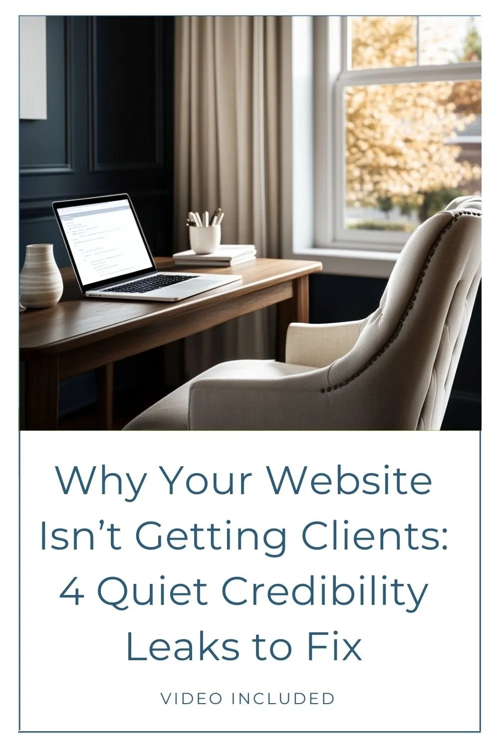
Prefer to watch instead of read? The video version is right here for you. Otherwise, keep scrolling!
What makes a website look unprofessional? It's almost never one thing.
That's the frustrating answer, but it's the accurate one.
Presence is the overall impression your website makes before someone has read a single word or clicked a single button. It's what they feel in the first few seconds — before any conscious decision-making — and it's either going to match the level you're operating at or it won't.
When your design, copy, imagery, and layout are all working together and telling the same story, the effect is nearly invisible. You don't notice good presence because it just feels right. But when those elements are out of sync, visitors register a low-level sense that something is off, even when they can't name what. That feeling of misalignment — showing up as our old friend, the credibility gap — is enough to make someone hesitate. And a hesitating visitor rarely books a call.
Five presence leaks that cost you credibility
1. Outdated design
Design has a shelf life. Not everything ages badly — some things genuinely hold up — but something that looked polished five years ago can read as neglected today, even if it was objectively good when it was built. The problem isn't that the design was ever wrong. It's that design exists in context, and if that context has shifted while your site stayed the same, it's carrying a timestamp your potential clients are registering whether you realize it or not.
If your site was built in a different chapter of your business, or was designed to match the trends of the time and hasn't been meaningfully updated since, it's probably showing visitors a version of your business that no longer exists. They're making decisions based on that version — not the current one, not the one doing the caliber of work you're doing right now.
A website that looks dated isn't just a visual problem. It's a trust problem.
2. Visual noise
Visual noise is what happens when too much is competing for attention at once: too many font styles, too many colors, too many graphical elements on a single page, none of them clearly in charge. The effect isn't just visual overwhelm. It communicates something about the business behind it. A cluttered, visually loud site reads as disorganized. It rarely signals the calm, capable expert behind it.
And this doesn't always mean a site is technically bad. Some visually busy sites are well-intentioned and make work for certain brands. But if a visitor's eye doesn't know where to land, or it feels chaotic, they won't stick around to figure it out on their own.
3. Copy that no longer sounds like you
This one sneaks up on people. If you wrote your website copy at a particular point in your business — in a particular voice, for a particular version of your ideal client — but your positioning has since evolved, that copy can now be actively working against you. It doesn't have to be bad writing. It can be technically solid copy that's just speaking to who you used to be, what you used to offer, and the client you were attracting two or three years ago.
When your positioning has sharpened, your income level has grown, or your perspective on your own work has shifted, copy that doesn't reflect any of that creates a disconnect. The clients who are a great fit for you right now may not recognize themselves in it so they’ll leave. Instead you continue to attract the wrong fit clients, because that’s who your copy still speaks to.
4. Inconsistency across pages
This is extremely common on sites that have grown organically. The homepage has one visual feel, the about page feels slightly different, the services page looks like it was built by a different person entirely, and the blog graphics don't match any of it. Different sections added at different times, without a unifying visual logic holding everything together.
Visitors pick up on this inconsistency even when they can't name it. It creates a low-grade sense of unreliability that's hard to shake. A site that feels like it was assembled from different reference points, even if you built every page yourself, tells a fragmented story. Visual consistency across your site is a trust signal. It communicates that the business behind the site is organized, intentional, and operating at a consistent standard.
This is also why giving visitors a clear path through your site matters so much alongside presence: even a well-structured journey breaks down if the pages along that path feel visually disconnected from each other.
5. Misaligned photography and imagery
This is the presence leak I want to spend the most time on, partly because it tends to be the most visible and partly because it's also the most solvable.
Your images are not decoration. They're doing communicative work whether you've been intentional about it or not. An outdated headshot communicates something. Stock photos that look like every other stock photo in your industry, or are incohesive, communicate something. The phone photos you put up as placeholders two years ago and never replaced — those are communicating something too. And none of it is saying what you actually want it to say, which is: this is a serious, established professional whose work I can trust.
When your imagery is misaligned with where you are in your business right now, it creates doubt that your copy then has to work to overcome. Copy fighting against the grain of your visuals is copy working uphill.
But image quality alone isn't the whole story. Placement and integration matter too. A strong image used poorly — dropped in as an afterthought, awkwardly sized, disconnected from the layout around it — is still a missed opportunity. Thoughtful image curation and placement are part of the design work, not separate from it. The images and the layout around them should be working together to guide attention and reinforce trust.
The good news: this is one of the more approachable presence problems to address, and it doesn't necessarily require as much as you'd think. I'll be getting into this specifically over the coming weeks, and the approach I take might genuinely surprise you.
Why website design credibility isn't a taste issue
Someone reading this is probably thinking: isn't this just about aesthetics? Personal taste?
It's not, and the reason comes down to how trust actually works.
Think about meeting someone at a professional event for the first time. Before they've said anything substantive, you're already reading them — the way they carry themselves, how they're dressed, the confidence in how they speak. You're not running through a conscious checklist. But you are forming an impression, and that impression shapes your expectations and whether you trust what they say or do next.
Your website does this same job when you're not in the room. It's the first handshake. And the question that handshake answers is whether what someone sees matches what they were expecting.
For established women entrepreneurs who've built real expertise and real results over years, this lands in a specific way. When your professional online presence is five years behind where you actually are, potential clients are meeting a version of you that no longer exists. They're making decisions based on that version. Worse is if they have met you already and then find your website is not at all what they expected! The credibility gap isn't just about your messaging. It's about everything your site communicates before anyone reads a word.
Fixing presence isn't vanity. It's accuracy.
A quick presence audit: where to start
Because presence is the sum of multiple elements, the temptation is to either overhaul everything at onceor do nothing because the scope feels overwhelming. Neither is actually useful.
Instead, do one focused pass through each of the five areas:
Outdated design: When was your site last updated in any meaningful way? Is it following dated design trends? Is it presenting your business as it exists right now, or is it carrying a chapter you've moved past?
Visual noise: Look at one page with fresh eyes. How many things are competing for attention? Is there a clear visual hierarchy, or are you asking visitors to sort it out themselves?
Copy: Read your homepage out loud. Does it sound like you, today? Does it speak to the client you actually want to work with now, or the one you were attracting two or three years ago?
Consistency: Click through your core pages in sequence. Do they feel like they belong to the same site? If one page feels noticeably different from the rest, that's the one to address first.
Imagery: Look at every image on your homepage. Does each one reflect the level you're currently operating at? Are they placed with intention, or dropped in to fill space? Do they look cohesive in terms of content and style? Do they support the story?
You don't have to fix all five at once. Start with the area where the gap is widest. And if you're not sure where that is, the Credibility Gap Type Quiz is built for exactly this — 11 questions, about two minutes, and you'll know your credibility gap type so you can focus your energy where it actually matters and skip the rest.
What happens when the gap actually closes
You've now got the full picture: clarity, proof, path, and presence. Four places a website leaks credibility, four areas where small, specific changes stop the drain.
The next post is about what comes after — the real shift that happens when you've found and fixed these gaps and your website finally matches your expertise. Not just what changes visually, but what changes for you and for your business when the version of you your site presents is actually the version you are. That's what's coming next, and it's worth the wait.
Ready to close the gap?
If you've been nodding along to this series and suspect your site has a presence problem — or if you're not sure where your credibility gap actually lives — the Credibility Gap Type Quiz is the place to start. Two minutes, 11 questions, and you'll know your gap type so you can fix what's actually broken and stop worrying about everything else.
If you're ready to close the gap for good with a site that finally reflects the expertise you've earned, you can explore custom web design and see what a full transformation looks like.
Or, if you'd rather start with a clear read on your current site before committing to anything larger, a Power Hour consultation is the fastest way to get specific, actionable answers without a full project.
Whichever direction makes sense, the goal is the same: a website that's finally in sync with the business you're actually running.
You may also find these articles helpful: