Your website is usually the last to know that your business has outgrown it.
How do I know?
Because it happened to me too.
I'm not just the founder of Purpose and Pixel. I'm also a client. (bonus points to anyone who gets the joke reference there 😉)
I recently put myself through the exact process I run my clients through — closing the gap between where my business actually is and what my website was saying about it. This is that story: what changed, why, and what it actually looked like to build it.
What You'll Learn in This Article
I walked through the entire redesign process on video: moodboard, fonts, image choices, and the new website. Be sure to view the companion video on my YouTube channel.
From Floating Lotus Design to Purpose & Pixel
Four years ago, in 2022, I started this business as Floating Lotus Design. I'm a former yoga and meditation teacher, and my first clients were exclusively in health and wellness. My name, my aesthetic, my service offerings — all of it was built for that niche.
That name stuck until January of 2026, when I changed it to Purpose and Pixel. But the shift was already in process by 2025.
The name change wasn't sudden. It was something I sat with for a long time, went through a lot of different directions before landing on something that actually fit. Most people niche down as they grow. I did the opposite. I found I loved working with established, successful women across industries, not just the wellness space I'd started in, and once that was true, Floating Lotus Design just didn't fit anymore. It worked really well for that niche, but it wasn't built to grow with where I was headed.
What It Looks Like When Your Business Outgrows Its Niche
When your business outgrows its niche, your website doesn't send you a memo. It just stops matching, and you're usually the last one to notice because you're too close to it. Or, like many of us, you’re too busy serving your clients and your own needs fall to the bottom of the priority list.
That's the credibility gap in its purest form — the space between what you're actually capable of and what your site is telling people. I've written about that in my Confident Client series in terms of clarity, proof,path, and presence.
My own version of it was more foundational than that. It wasn't just a messaging problem. The name itself no longer told the truth about who I served or what I did and even after the name changed, my website was stuck in a place in between the two, until now.
If you've expanded your scope, raised your prices, or started attracting a different kind of client than the one your original brand was built for, this is worth thinking about. Not because change for its own sake is good — it often isn't. But because a mismatch between your business and your brand could cost you the exact clients you're now capable of serving.
Finding myself in this situation, I cleared my calendar and became my own client and began the process of rebranding and rebuilding. Here’s how that went.
The Moodboard, the Colors, the Fonts
Once I had the new name and logo, I put myself through my own branding process, the same one I'd run a client through. Voice work, copy, all of it. I began with a moodboard, which was the inspiration and anchor for the redesign itself.
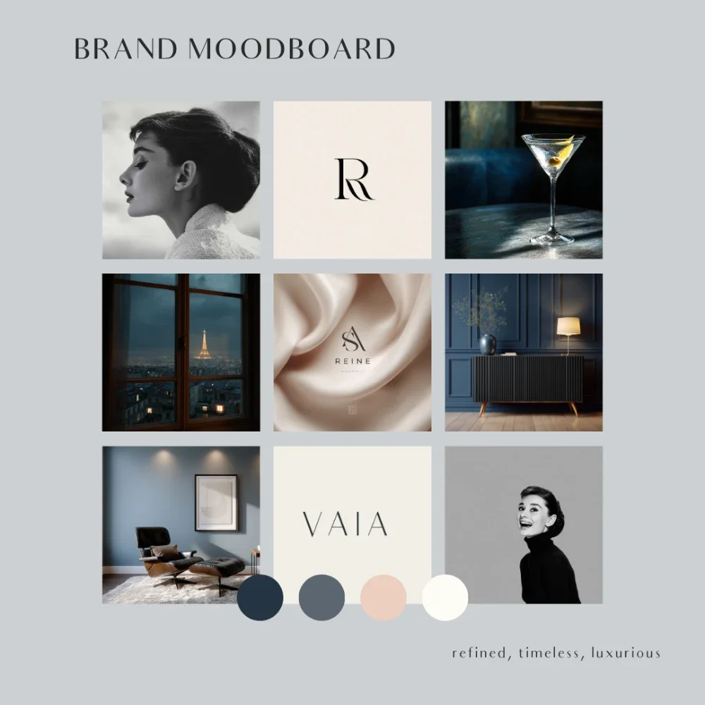
I kept my existing color palette — navy, cream, a little gray, a touch of peach and coral as an accent. Timeless colors, not trendy ones. I wanted to work with black-and-white photography alongside color, and I leaned hard into mid-century modern: clean minimalism, but with warmth to it. Accessible and comfortable, but refined.
Fonts came next, and this time I really wanted something custom. Not trendy, not overused — clean, easy to read, nothing stressful on the eyes, something that would blend with and support the whole design instead of competing with it.
Walking Through My New Website
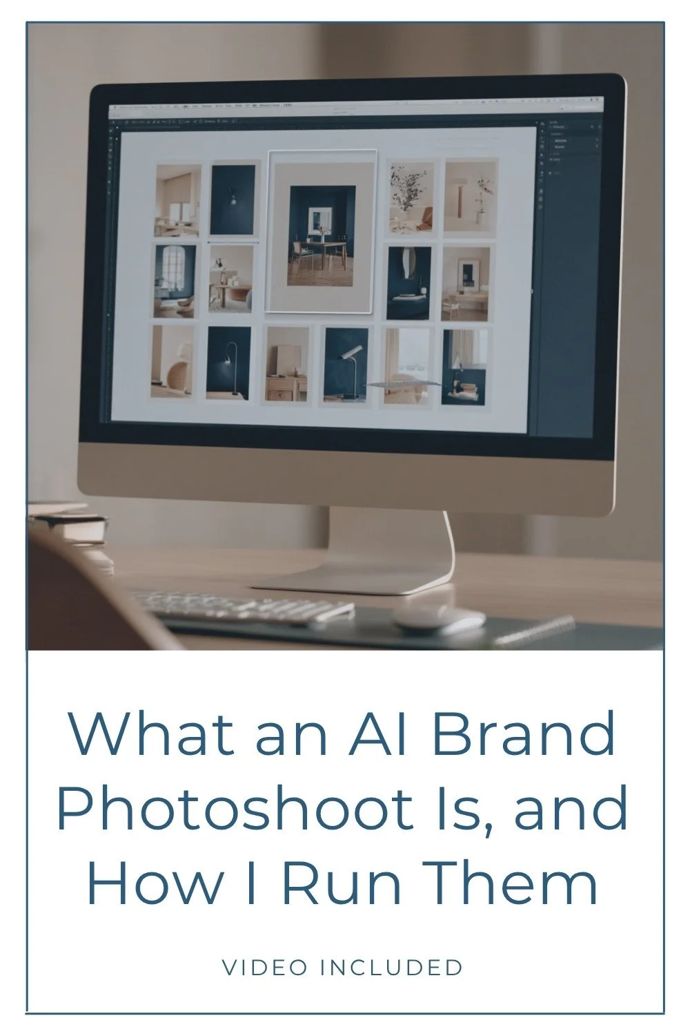
Here's where I'll be honest: almost every image on the new site, I made myself, using the same AI photography process I offer clients. That wasn't incidental. I offer that service. I wanted to be able to show people what it actually produces, not just tell them. You do not need to use AI to work with me, but since I offer it I feel it’s important to display my skills to those who are interested.
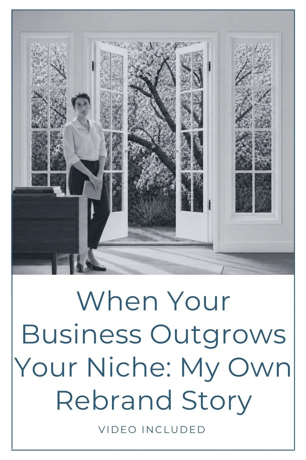
The homepage opens in black-and-white. I did that on purpose. I wanted a light, cream background up top so I'd have room to play with color further down the page, and I wanted that opening section to feel calm, almost pared back, before anything else happens. You don't see a lot of sites start that way, and that was the point. I wanted someone landing on the page to feel, right away, that this wasn't going to be a standard web design studio site.
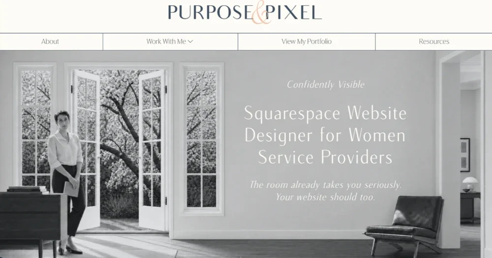
The bigger goal wasn't just to describe what I do. It was to make the actual experience of scrolling through the site feel like what it's like to work with me. Calming. Not overwhelming, not in your face. Plenty of breathing room between sections so you have a second to take something in before the next thing shows up. Invitations to pause and take things in. If someone never talks to me, never watches a video, I want them to finish scrolling through the site with a sense of what working together would actually feel like.
That's also why I stayed away from typical stock photography. There's an occasional laptop/office shot, but it's intentional, not a placeholder. Mostly I wanted images that are evocative rather than literal — representative of the experience instead of a stock photo checking a box. And I kept that consistent page to page on purpose. Whether you land on my homepage or my services page, I wanted the same look and feel to be immediately obvious, so if someone's exploring the site, nothing feels jarring or disconnected from page to page. That consistency and cohesion is doing real work. It's telling someone, without saying it outright, that this was built with intention.
Practicing What I Preach
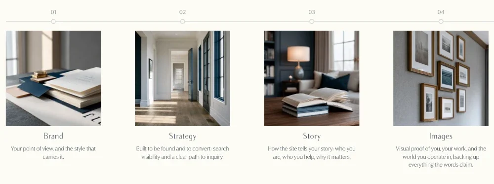
Somewhere in the middle of all this, it hit me: I don't just build websites. What I actually build are visual credibility systems, imagery, structure, and message working together to support the authority a client has already earned.
That realization changed how I think about my own offers, not just my clients'.
What Changed in My Offers
Rebuilding the site also forced a harder conversation about capacity. I'm a one-woman studio. No team, nothing delegated out. To provide the level of attention and service I pride myself on balanced with the work that brings me creative joy, I realized I couldn’t do it all and something had to give.
So I stopped offering standalone SEO services. That wasn't an easy call. My SEO Quick Wins service was popular. But SEO strategy and foundational work is now built into my custom web design packages, and I can still help with audits or technical questions through Power Hour consultations or Design Days. SEO isn’t completely gone. It's just reserved for my design clients now.
What I built, and what I'm genuinely proud of, is flexibility. Custom web design sits at the core, with branding and AI imagery available either as add-ons or as fully standalone services. If you've already got branding, a copywriter, an SEO person or a photographer in place, we can work with what you've developed with them. If you need the full suite, we can do that too.
The Website Finally Matches the Business
That uneasy feeling of hesitating before you send someone your website link, isn't something to push past. It's information. It's the same signal I point out to clients all the time, and this time it was pointing at my own business. So I’ve been there and I get it. And I also know how good it feels to be on the other side of that.
My site finally matches what I've actually built and continue to build. Not where I started four years ago.
If any of this sounds familiar, if your business has moved past what your website is currently saying about it, explore custom web design and see what closing that gap could look like for you.
You may also find these articles helpful: